

Which Book Cover Should I Use? (Poll)
michaelmohr.substack.com
Which Book Cover Should I Use? (Poll)
Help me choose a cover!

Punkers:
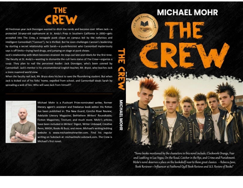
THE CREW:
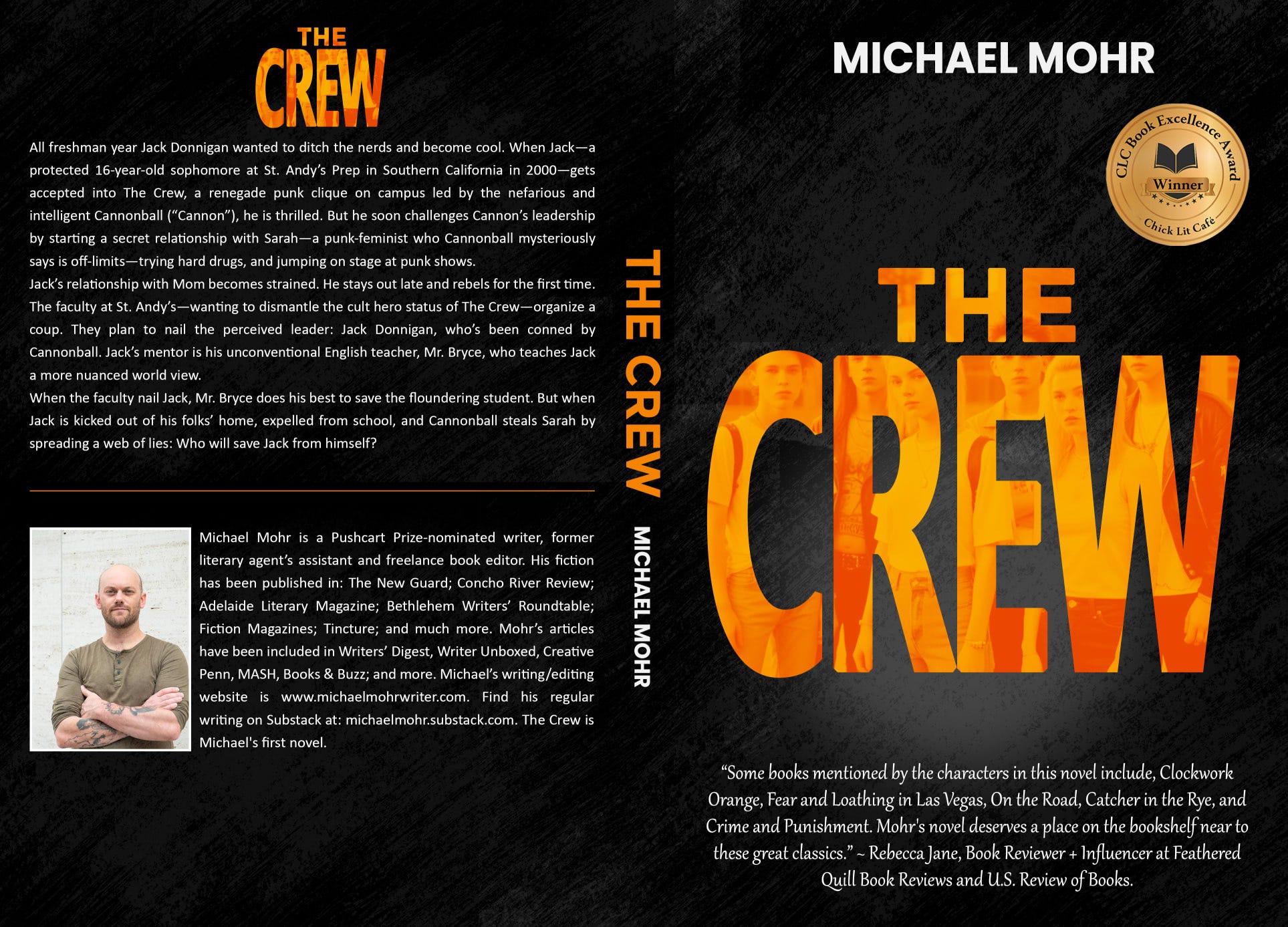
Here’s a description of the book (It’s a coming-of-age punk-literary YA novel with deep themes):
https://www.amazon.com/Crew-Michael-Mohr/dp/B0CTRRBM6J/ref=cm_cr_arp_mb_bdcrb_top?ie=UTF8
Punkers, but see if you can loosen up the justified back blurb going ragged right and move the front blurb with that (maybe edit down the "About" blurb to lead with the endorsement. That would give more room to pop up the cover photo, which is dynamic. Everyone flips a book over anyway, so you're not losing anything. I used to design and edit books.
Punkers is better – human faces, always human faces! You might want to rethink the negative space - it's overcrowded, far too many words, and there's some kind of competition going on between the title and the image, I don't know enough about to sign to say what. Good luck! I like those kids, I'm immediately interested in their cruel fates!